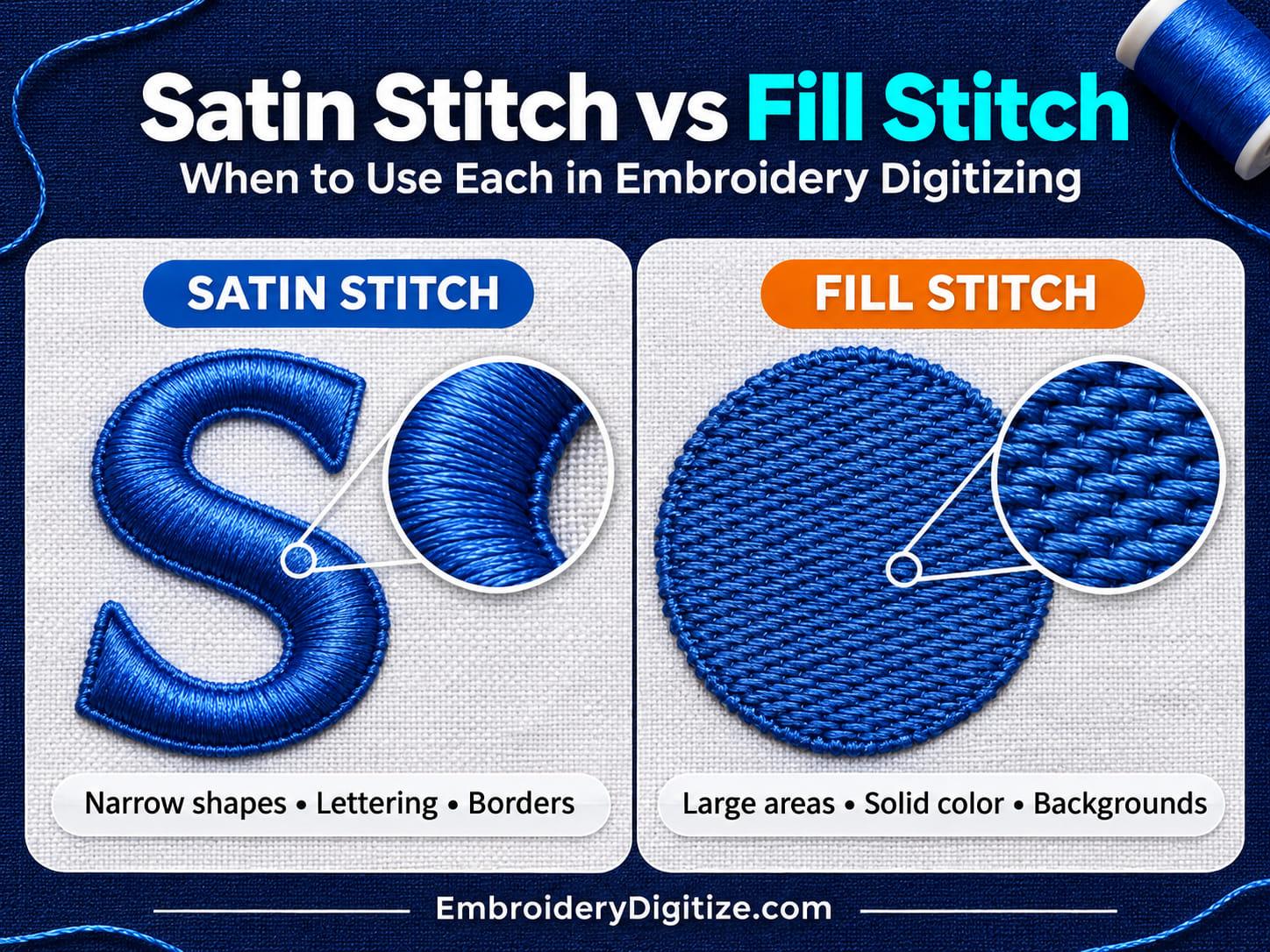
Quick answer: Use satin stitch for narrow shapes, up to about 7 to 10 mm (roughly 1/4 to 3/8 inch) wide, such as lettering, outlines, and borders. Use fill stitch for larger areas that are too wide for satin. Most logos use both: fill for the big shapes and satin for the edges and text.
Open almost any embroidered logo and you will find two stitch types doing most of the work: satin stitch and fill stitch.
They look different, behave differently, and solve different problems. Choosing the right one for each part of a design is one of the most important decisions in embroidery digitizing, and it directly affects how clean, durable, and professional the finished embroidery looks.
In this guide to satin stitch vs fill stitch, we'll explain what each one is, when to use it, how digitizers combine them in real logos, and the mistakes that lead to loose edges, gaps, and puckering.
What Is a Satin Stitch?
A satin stitch is a series of closely spaced, parallel stitches that run straight across a narrow shape from one edge to the other. Because each stitch spans the full width of the shape, the thread lies smooth and catches the light, which gives satin its glossy, slightly raised look.
Satin Stitch Is Commonly Used For:
- Lettering and monograms
- Borders and outlines
- Narrow columns and stems
- Small shapes and fine logo details
- Patch borders
How Wide Can a Satin Stitch Be?
Satin stitch works best in narrow shapes. Wilcom, the maker of EmbroideryStudio digitizing software, recommends a maximum satin width of around 10 mm (up to 12 mm in some cases) and suggests splitting long stitches at around 7 mm to improve durability. The exact limit depends on the fabric, the thread, and the machine.
- Too narrow (under about 1 mm): a satin stitch cannot be narrower than the needle that sews it, and very narrow columns get too dense. A thin line is usually stitched as a running stitch instead.
- Too wide (over about 10 mm): the long stitches can become loose, may not cover the fabric evenly, and are more likely to snag.
When a satin shape is too wide, digitizers usually switch that area to fill stitch, use a split satin setting that breaks long stitches into shorter ones, or divide the shape into narrower columns.
What Is a Fill Stitch?
A fill stitch, often called a tatami stitch, covers an area with rows of shorter stitches laid side by side. The stitches in neighboring rows are offset from each other, which avoids straight lines of needle holes and creates a flat, textured finish.
Instead of one long stitch crossing the whole shape, many short stitches build up the coverage. Fill stitch can run in a single direction, follow a pattern, or change angle across a design to add texture and dimension.
Fill Stitch Is Commonly Used For:
- Large solid areas of color
- Backgrounds and shapes too wide for satin
- Logo bodies, icons, and illustrations
- Textured or patterned areas
- Areas where stitch direction adds shading or dimension
Because fill stitches are short and held in place by the rows around them, they stay stable even across large areas. The trade-offs are that covering a big area takes many stitches, fill can feel stiff or heavy when it is too dense, and it is less suited to very small, detailed shapes.
What Is the Difference Between Satin Stitch and Fill Stitch?
Satin stitch uses long, parallel stitches that span a narrow shape from edge to edge, which gives a smooth, glossy finish. Fill stitch uses rows of short, offset stitches to cover larger areas, which gives a flatter, textured finish. Satin suits lettering, borders, and outlines. Fill suits large solid areas and backgrounds.
| Feature | Satin Stitch | Fill Stitch |
|---|---|---|
| Best for | Narrow shapes, lettering, borders, outlines | Large areas, solid color, backgrounds |
| Typical width | Narrow: about 1 mm up to 7 to 10 mm | Wider areas, from medium shapes to large backgrounds |
| Appearance | Smooth, glossy, slightly raised | Flatter, with a visible stitch texture or pattern |
| Stitch length | Long, spanning the full width of the shape | Short, in offset rows |
| Main risk | Loose or snagging stitches when too wide | Stiffness and bulk when too dense, and a poor fit for tiny details |
When Should You Use Satin Stitch?
Choose satin stitch when a shape is narrow and you want a clean, defined, glossy finish.
Lettering
Satin is the standard choice for text, because each letter stroke is a narrow column. A common rule of thumb is to keep lettering at least about a quarter inch (6 mm) tall, although the real limit also depends on stroke width, thread, and needle. Smaller text often needs a simpler font, a finer thread and needle, or a running stitch. A test stitch-out is the most reliable check. ASI's guide to small lettering covers this in more detail.
Borders and Outlines
A satin border gives a design a sharp edge and neatly covers the boundary where a fill area ends. This is why many embroidered patches use a satin border. Learn more in our embroidery patch digitizing guide.
Fine Details
Narrow stems, small shapes, and decorative accents look best in satin, because the long stitches give them smooth, solid coverage.
When Should You Use Fill Stitch?
Choose fill stitch when an area is wide, solid, or needs texture.
Large Solid Areas
The body of a logo, an icon, a shield, or any large shape should normally be fill. Satin across a wide area would need very long stitches that snag and wear.
Backgrounds and Wide Shapes
Fill keeps large areas stable and evenly covered, even on stretchy or textured fabrics when the underlay and density are set correctly.
Texture, Shading, and Dimension
Changing the stitch angle or using a pattern fill can create light and dark effects, so a single thread color can look different from one part of the design to another.
How Do Digitizers Combine Satin and Fill?
Most real logos use both stitch types. Picture a round badge with a name in the middle: the body of the badge is fill, the outer ring is a satin border, and the lettering is satin.
A typical stitching order looks like this, although the exact order depends on the design:
- Fill the large areas first. Each object gets its own underlay, which stabilizes the fabric before the visible stitches go on top.
- Add satin borders and outlines. They sit over the edges of the fill and make the shape look sharp and finished.
- Stitch lettering and fine details last. This keeps them on top, where they stay clean and readable.
The stitching order also affects how many color changes, trims, and jumps the design needs, which is why it is planned as part of the digitizing and not left to chance.
Underlay, Density, and Pull Compensation
Picking satin or fill is only part of the job. Three other settings decide whether the stitches look right on the fabric:
- Underlay: a foundation of stitches that supports the top stitches. Read our guide to embroidery underlay.
- Density: the spacing between stitches. Too dense makes the design stiff and can cause puckering or thread breaks. Too open lets the fabric show through.
- Pull compensation: stitches pull the fabric inward as they are sewn, so digitizers extend shapes slightly to make up for it. See our guide to pull compensation.
Which Stitch Should You Use?
Use this quick guide:
- Letters and numbers: satin. Very large block letters with wide strokes may use fill instead.
- Thin outlines and borders: satin.
- Large logo shapes and backgrounds: fill.
- Very thin lines (under about 1 mm): running stitch.
- Shapes wider than about 10 mm: fill, split satin, or narrower satin columns.
- Shading and texture: fill with a pattern or a changing stitch angle.
Common Satin and Fill Mistakes
Using Satin on Wide Shapes
Long satin stitches loosen, snag, and lie unevenly. Wide shapes belong in fill, split satin, or narrower satin columns.
Using Fill on Tiny Details
Small, thin shapes stitched as fill can look rough and uneven. They usually look better as narrow satin columns or running stitches.
Setting the Density Too High
More stitches do not mean better embroidery. Overly dense satin or fill makes the design stiff and heavy, and it can cause puckering or thread breaks.
Skipping Underlay or Pull Compensation
Without them, you can see gaps between a fill area and its satin border, thin or distorted letters, and edges that do not line up.
Ignoring the Fabric
Stretchy knits, towels, fleece, caps, and woven fabrics all behave differently. The same design usually needs different underlay and density on each. For caps, see our hat embroidery digitizing guide.
How Satin and Fill Affect Stitch Count
Stitch count is the total number of stitches in a design. It affects how long the design takes to sew and how it is priced. Large fill areas usually add the most stitches to a design, while heavy lettering and borders add up quickly too. Our guide to stitch count explains how it is calculated and why it matters.
Frequently Asked Questions
What is the difference between satin stitch and fill stitch?
Satin stitch uses long, parallel stitches across narrow shapes for a smooth, glossy look. Fill stitch uses rows of short, offset stitches to cover larger areas with a flatter, textured look. Most designs use satin for lettering and borders and fill for large areas.
Can I use satin stitch for a large area?
You can, but it is usually not recommended. Satin stitches across a wide area are long and loose, so they snag and wear easily. Large areas are normally better as fill stitch, split satin, or narrower satin columns.
How wide can a satin stitch be?
Wilcom recommends a maximum satin width of around 10 mm, with up to 12 mm possible in some cases, and suggests splitting long stitches at around 7 mm. Wider shapes are usually stitched as fill, split satin, or narrower satin columns.
Which is better for text, satin or fill?
Satin is the standard choice for most lettering, because letter strokes are narrow. Very large letters with wide strokes may be stitched in fill.
Is fill stitch the same as tatami stitch?
Yes. Tatami is another name for fill stitch. Both terms describe rows of short, offset stitches that cover an area.
Can one design use both satin and fill?
Yes. Most logos do. Fill covers the large areas, and satin handles the borders, outlines, and lettering.
Why does my satin text look thin or gappy?
Common causes are missing or incorrect underlay, too little pull compensation, text that is too small, and fabric that is stretchy or textured. Digitizing settings are usually adjusted to fix these.
Do I need to choose the stitch types when I order digitizing?
No. Choosing the right stitch type for each part of your artwork is part of the digitizing work at EmbroideryDigitize. You provide the artwork, the size, the garment type, and the file format your machine uses. To see how the whole process works, read our step-by-step guide to digitizing a logo for embroidery.
Final Thoughts
Satin and fill are the two building blocks of most embroidery designs. Satin gives narrow shapes a smooth, glossy, well-defined finish. Fill covers larger areas with stable, even coverage.
The best digitizing uses each one where it works best, then adds the right underlay, density, and pull compensation so the design stitches cleanly on the actual fabric.
Sources and Further Reading
The size ranges in this guide are general industry guidelines. The exact limits depend on your machine, fabric, thread, and software, so run a test stitch-out before production.
- Embroidery stitch techniques (Wilcom): satin and tatami stitch descriptions, satin width guidance, and splitting long stitches.
- Applying satin stitch (Wilcom EmbroideryStudio help): how column width affects coverage and density.
- Keep Your Small Letters Crisp (ASI): lettering height, needle, thread, and underlay advice for small text.
Need a Logo or Custom Design Digitized?
Turn your logo, artwork, or custom design into a production-ready embroidery file.
Create your free EmbroideryDigitize account and submit your artwork, required size, garment type, and preferred embroidery format.
Existing customer? Login here.
If you already have an embroidery file but need another machine format, use our Free Embroidery Format Converter to convert supported embroidery files online.